
MLB Logo Redesign: Cleveland Indians/Guardians
I was inspired by the ESPN column by Bradford Doolittle in 2020 to take my own pass at the Cleveland Indians rebrand. His take on using a unique moniker in professional sports (Spiders) as well as rewriting some of the baseballs historically bad teams drove me to explore this avenue and see something unique built on an old chassis.
Cleveland Baseball History
The history of the names of the baseball teams in Cleveland reflects the city's rich sports heritage. The city's Major League Baseball team has gone through several name changes over the years. Originally established as the Cleveland Forest Citys in 1865, they were one of the founding members of the National League in 1871 and became known as the Cleveland Blues. In 1901, they joined the newly formed American League and adopted the name Cleveland Bluebirds, which was soon changed to the Cleveland Broncos and then the Naps in honor of their star player Napoleon Lajoie. In 1915, after Lajoie's departure, the team became the Cleveland Indians, a name that stuck for more than a century. However, amidst growing concerns about cultural sensitivity and respect, the team announced in 2021 that they would be changing their name, marking a significant moment in the evolution of Cleveland's baseball identity.

The Indians Rebrand
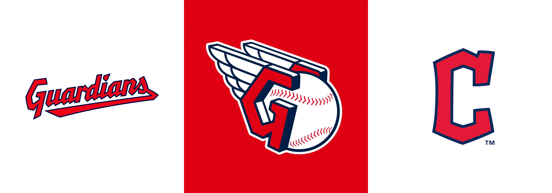
Before becoming the Cleveland Guardians, the baseball team was the Cleveland Indians, known for a century with a controversial Native American-themed brand, including the "Chief Wahoo" logo. Amid ongoing criticism, the team phased out the logo, officially discontinuing it in 2019.

The Guardians Rebrand
The Cleveland Guardians marked a turning point in the city's baseball history, shifting from a criticized name and imagery to a new, inclusive identity inspired by the "Guardians of Traffic" statues, showcasing the city's resilience and modern spirit.
I do think this was a step in the right direction, but I feel the Cleveland team should have drawn from it’s rich history rather than pave a new identity.

My Approach
Although I appreciate the Guardians rebrand and long awaited update, I really think much of Clevelands past could have been used to revive such a historical and rich sport (not to mention it as “America’s past-time”). Cleveland in and of itself is full of historical figures, events, teams etc that I think would have made for a special scenario to not pave over choices that were made in the past around the Indians, but kind of a compromise with the Cleveland fan-base. Give them something to hold onto - something that’s new, but harkens a bit of Cleveland’s heritage.
Before starting out on redesigning the Cleveland Indians brand, I wanted to get a better understand of Cleveland. Understand what connects with fans. I felt these adjectives should also be reflected in the identity system and it’s touch-points.
Industrial
Cleveland's industrial identity is rooted in its historical significance as a major center for manufacturing, steel production, and heavy industry.
Underdog
Cleveland is viewed as an underdog due to its historical economic challenges, Rust Belt struggles, and sports teams facing extended periods of adversity, fostering a resilient identity that defies setbacks.
Friendly
Cleveland's friendliness is evidenced by its high rankings in national surveys, fostering a welcoming atmosphere rooted in the city's Midwestern values and warm community spirit.


